
The Project
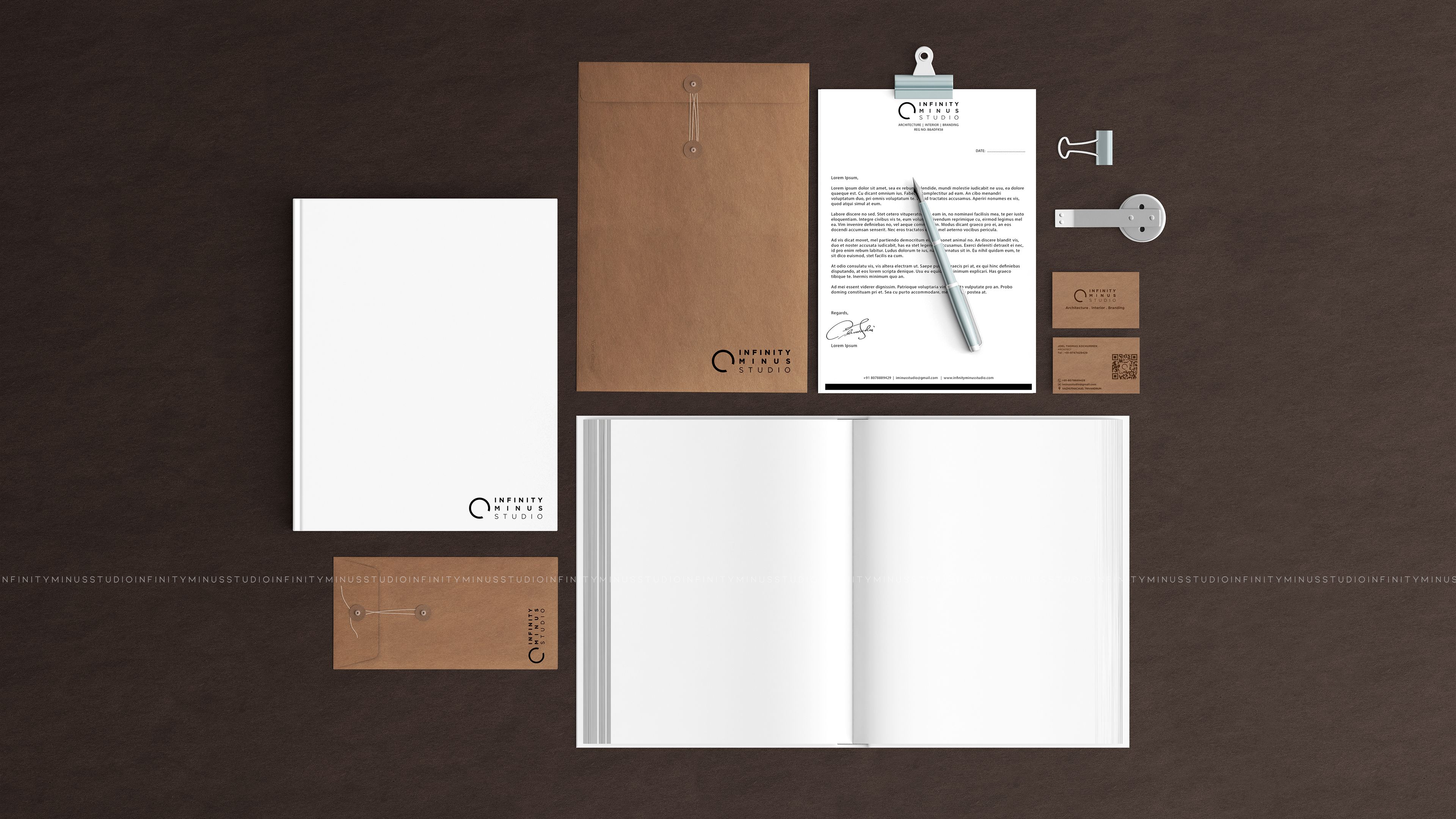
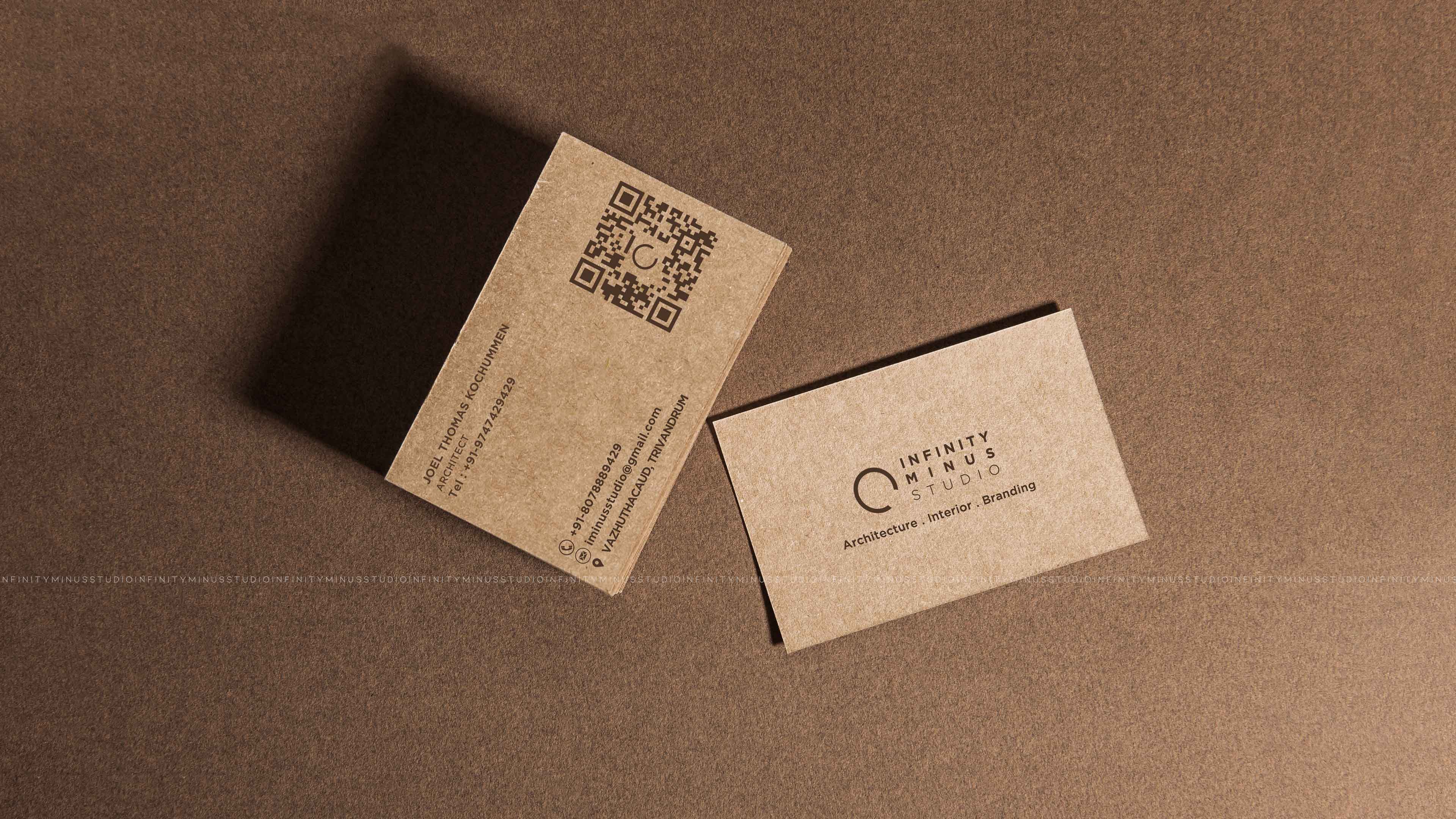
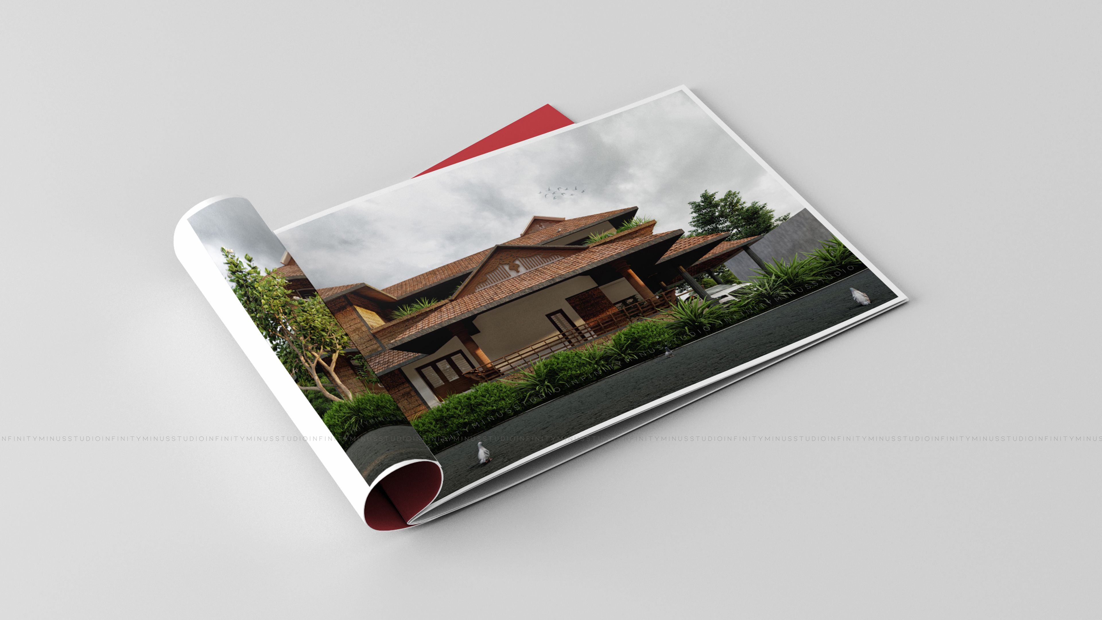
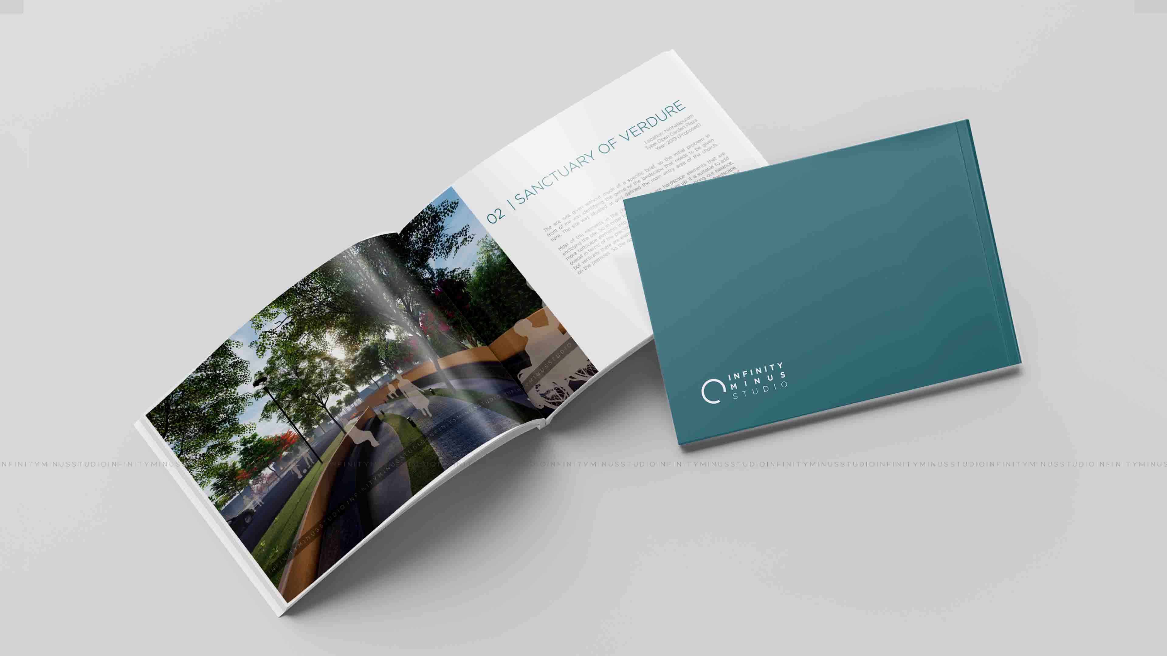
This was our very first branding work with which we brought together as a whole. Our idea was to play with basic geometry to intertwine with our conceptual thoughts to bring out an ‘abstruse at first sight’ yet succinct design in all our branding elements. Generic elements like business cards, folders, etc followed a tri-color scheme to set the overall brand identity to a neutral and subtle tone. Specific changing elements like brochures of different typologies were lacquered with bright yet faint color tones, where colors were chosen depending on the type of content.
Location:
Trivandrum
Type:
Branding
Year:
2019